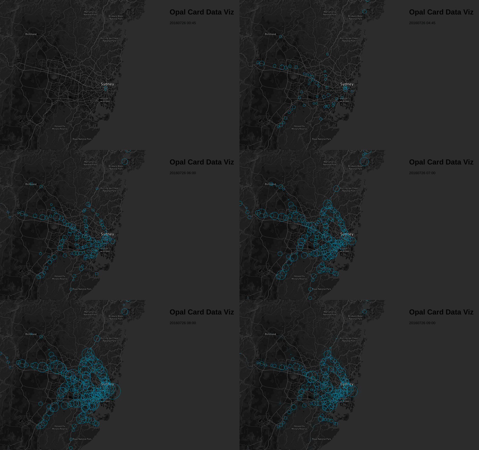
A few months ago, NSW Transport released Opal Card travel data to the public through its open data portal.
My initial idea was to build a visualization similar to Uber’s Viz to show bus and train commutes. I assumed the data would be de-identified but would include individual tap-on/tap-off locations for each card. However, I was disappointed to find that the data only consisted of aggregated tap counts at 15-minute intervals per station. For those unfamiliar, the Opal Card is Sydney’s equivalent to London’s Oyster Card.
Despite the limitations, I decided to visualize the flow of commuters throughout the day. I was keen on experimenting with D3.js for this project. While I initially struggled with raw shapefiles, I soon discovered Leaflet and Mapbox. I chose Mapbox for its superior map customization capabilities.
Data Sample
Here is a look at the raw data from the portal:
| Mode | Date | Tap | Time | Location | Count |
|---|---|---|---|---|---|
| bus | 20160730 | on | 02:30 | 2000 | 415 |
| bus | 20160730 | on | 02:30 | 2135 | 18 |
| train | 20160730 | on | 02:30 | Jannali Station | 31 |
| bus | 20160730 | on | 13:30 | 2095 | 64 |
Since bus data is aggregated at the postcode level, it felt too coarse for a meaningful visualization. I decided to focus exclusively on train data, as station locations are more precise. I used R to filter and geocode the station names. My geocoding script is available here.
Pre-processing with R
First, I geocoded the unique station names:
library(dplyr)
library(stringr)
library(jsonlite)

data <- read.csv("Data/time-loc_20160725-31.csv") %>%
    filter(mode=="train")

# Get unique station names
stations <- data %>%
    select(loc) %>%
    unique()

# Append ", New South Wales" for better geocoding accuracy
stations$loc2 <- as.character(stations$loc) %>%
    paste(", New South Wales", sep="")

# Geocode each station
stations$geo <- NA
for(i in 1:nrow(stations)){
  print(paste("Working on index", i))
  stations$geo[i] <- getGeoDetails(stations$loc2[i])
}
# Split results into lat/lon
stations[,c(4:6)] <- str_split_fixed(string = stations$geo, pattern = ";", n=3)
stations <- stations %>%
    select(-c(V6, geo, loc2)) %>%
    rename(lat=V4, lon=V5)

data <- left_join(data, stations, by="loc")
Once geocoded, I used D3.js to build the visualization. Because I spend a lot of time in Tableau, I initially approached D3.js with a similar mindset. However, I soon realized that if a station had zero tap-ons during a specific window, it was missing from the dataset. To ensure a smooth animation, I had to expand the data to include these zero-value records.
library(dplyr)
library(lubridate)

opal_data <- read.csv("Full Data.csv") %>%
    select(-X, -mode) %>%
    filter(loc != "UNKNOWN")

train_tap_on <- opal_data %>%
    filter(tap == "on")
rm(opal_data)

# Create unique timestamp and station lists for a cross join
stations <- train_tap_on %>% select(loc, lat, lon) %>% unique()
timestamp <- train_tap_on %>% select(datetime, date, time) %>% unique()

stations$j <- 1
timestamp$j <- 1

# Complete the dataset with zero counts where data is missing
data <- inner_join(stations, timestamp, by='j') %>% select(-j)
data <- arrange(data, datetime, loc)

train_tap_on <- train_tap_on %>% select(-tap, -lat, -lon, -date, -time)
data <- left_join(data, train_tap_on, by=c("datetime", "loc"))
data["count"][is.na(data["count"])] <- 0
The Final Visualization
With a complete dataset, I created an animated visualization showing commuting patterns over an entire week. You can see the result here.

This project is still in its early stages, but it’s a solid foundation for future NSW transport data analysis. The source code for the visualization is available on GitHub.