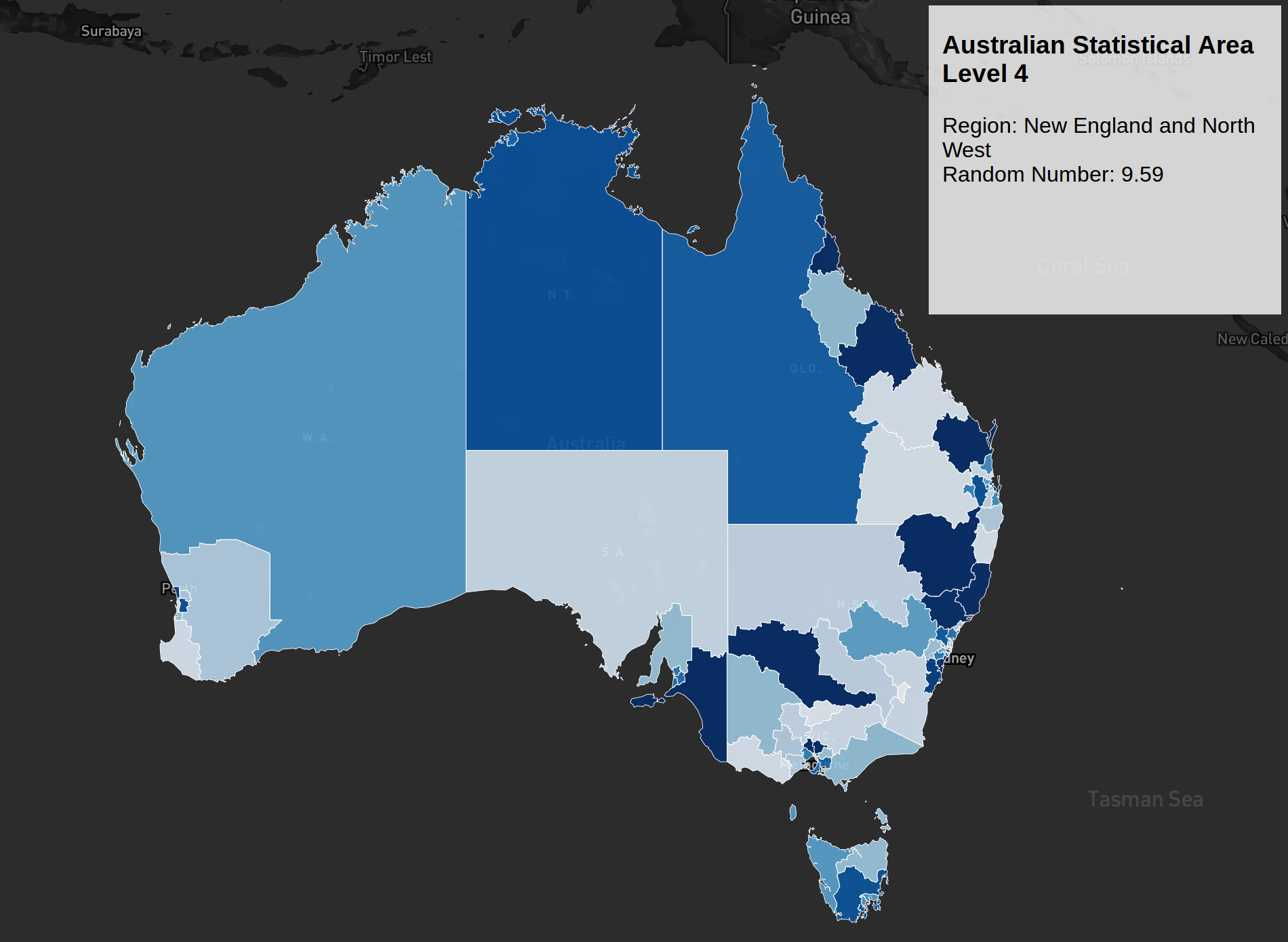
Following my post on the Opal Card visualization (which still needs some improvements), I decided to tackle another mapping project for work. As I mentioned earlier, I prefer using Mapbox because it offers great flexibility in map design. Being relatively new to D3.js, I often learn by experimenting with examples; however, finding specific D3.js and Mapbox integration examples was initially a challenge. I eventually discovered blockbuilder, which opened up many more possibilities. Prior to this, most examples I found were either focused on US regions or required converting shapefiles through the shp2geo package—a process that felt a bit too steep for my initial foray into Australian geographic data.
Australian shapefiles are available on the ABS website. Reaching the final visualization involved overcoming several technical challenges:
-
Converting Shapefiles to GeoJSON
Solution: Mapshaper -
Map Fails to Load via Mapbox API
Findings: The Coordinate Reference System (CRS) was missing in the GeoJSON file exported from Mapshaper.
Challenge: Theshp2geopackage didn’t seem to add the CRS attribute correctly, or perhaps I was misconfiguring it.
Solution: I loaded the shapefile into QGIS and exported it as GeoJSON with the correct CRS. -
Slow Rendering for Large Shapefiles
Solution: I simplified the shapefile using the Visvalingam weighted area algorithm. This makes the polygons smoother by removing non-essential points at acute vertices. I then repeated the QGIS export process with the simplified file.
These optimizations significantly improved loading times without noticeably compromising the detail of the polygons. This map is a fork of Ian Johnson’s block, but with additional custom color coding. Currently, it uses a random number generator for the colors, but the long-term plan is to bind this to actual population data for each SA4 region.
Interactive SA4 Map
Below is the live interactive map. Hover over regions to see details, and click to zoom in:
Interactive map showing Australian Statistical Area Level 4 regions with random color coding. Each region displays different values when hovered.
You can also view the map in full screen mode for the best experience.
Original Screenshot
For reference, here’s the original static screenshot from when this post was first written:
