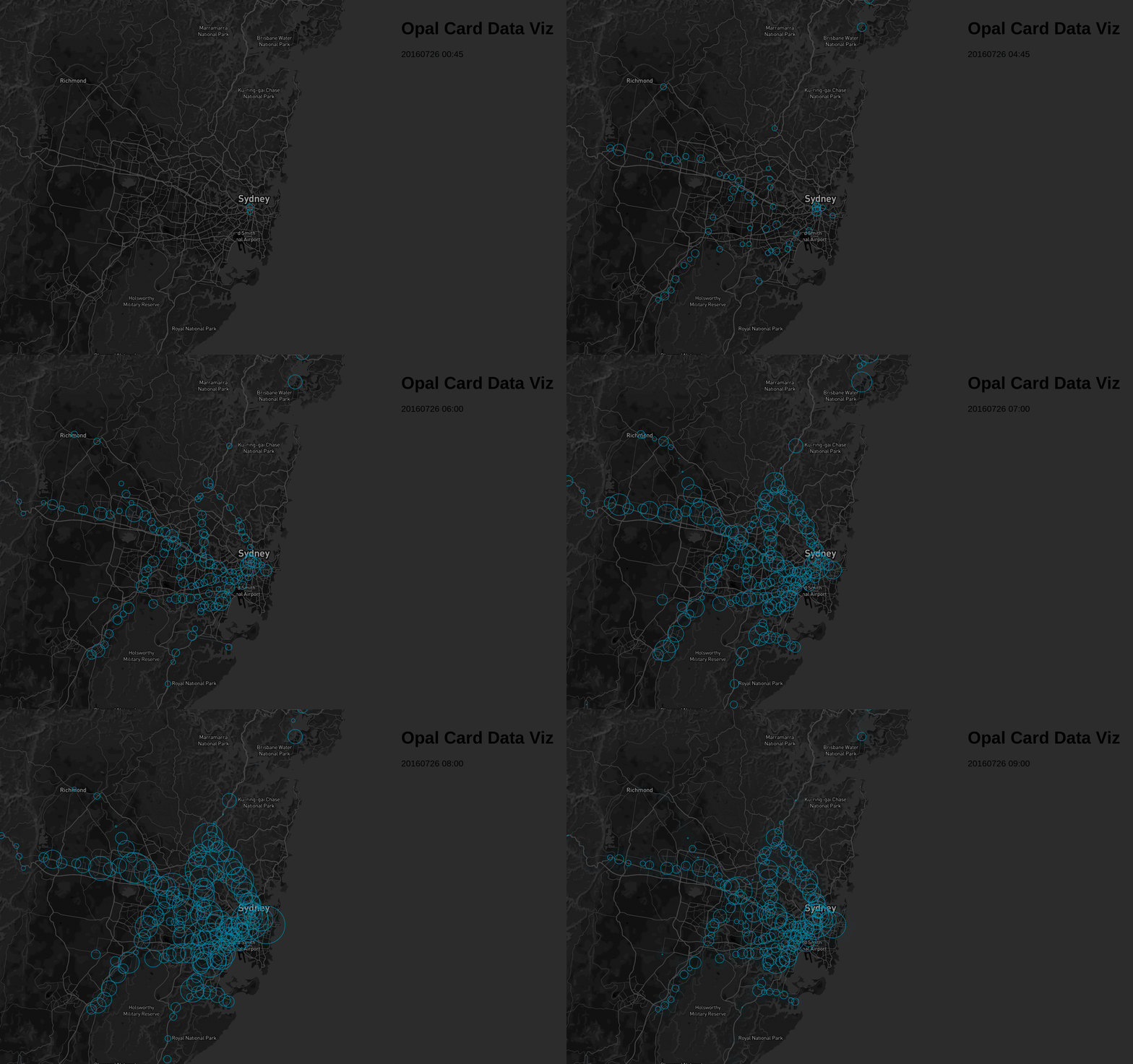
A few months ago, NSW Transport announced to release Opal Card travel data to the public through its open data portal.
First thought was to try and build something like Uber’s Viz for train/bus commute. I assumed that the data will be de-identified and would consist of tap on/off location of each opal card, but was left disappointed after I downloaded the data. The data only consisted of Tap on/off count at 15 minutes interval at stations. For those who do not know about how opal card works, its similar to Oyster card in London.
With the data already downloaded I could only think about visualising it on a Map showing how people travel during the day. I had seen a few examples of d3js and was keen on replicating it. I started with the tutorials using Maps - shapefiles but got entangled, confused and didn’t find it pretty to just use the shape. So I started looking for api and came across leaflet and mapbox. I went with Mapbox with the sole reason that it allows Map customisation.
Sample of the raw data downloaded from Open data portal is as per below.
| mode | date | tap | time | loc | count |
|---|---|---|---|---|---|
| bus | 20160730 | on | 02:30 | 2000 | 415 |
| bus | 20160730 | on | 02:30 | 2135 | 18 |
| train | 20160730 | on | 02:30 | Jannali Station | 31 |
| bus | 20160730 | on | 13:30 | 2095 | 64 |
As the bus tap on/off data is at postcode level, there isn’t much I could do with it. So I decided to concentrate on train instead as I can get the locations of station. First things first, I filtered the data and geocoded to get stations locatons using R. The geocoding function that I use can be found here
library(dplyr)
library(stringr)
library(jsonlite)
data <- read.csv("Data/time-loc_20160725-31.csv") %>%
    filter(mode=="train")
#get unique locations - Stations Name
stations <- data %>%
    select(loc) %>%
    unique()

#add nsw
stations$loc2 <- as.character(stations$loc) %>%
    paste(",New South Wales",sep="")

#geocode
stations$geo <- NA
for(i in 1:nrow(stations)){
  print(paste("Working on index", i))
  #query the google geocoder - this will pause here if we are over the limit.
  stations$geo[i] <- getGeoDetails(stations$loc2[i])
  print(substrRight(stations$geo[i],6))
}
stations[,c(4:6)] <- str_split_fixed(string = stations$geo,pattern = ";",n=3)
stations <- stations %>%
    select(-c(V6,geo,loc2)) %>%
        rename(lat=V4,lon=V5)

#geocoded data
data <- left_join(data,stations,by="loc")
Once I had the geocoded data, I loaded it using d3 and started creating the viz. As I spend a lot of time visualising data using tableau, I started using d3 the same way I would use Tableau. with the data loaded, I started to create some circles without realising that If a station had no tap on, it’s excluded from the original file. So I had to go back to prepare my data for d3 to use it.
library(dplyr)
library(lubridate)

#remove unused cols and loc
opal_data <- read.csv("Full Data.csv") %>%
    select(-X,-mode) %>%
        filter(loc!="UNKNOWN")
train_tap_on <- opal_data %>%
    filter(tap=="on")
rm(opal_data)

#create timestamp string
train_tap_on <- mutate(train_tap_on,datetime=paste(date,time,sep=" "))

#unique coordinates
stations <- train_tap_on %>%
  select(loc,lat,lon) %>%
  unique()

#unique timestamps
timestamp <- train_tap_on %>%
  select(datetime,date,time) %>%
  unique()

#create attributes for cross join
stations$j <- 1
timestamp$j <- 1

#join and sort data
data <- inner_join(stations,timestamp,by='j') %>%
    select(-j)
data <- arrange(data,datetime,loc)

rm(stations)
rm(timestamp)

#remove unused cols
train_tap_on <- train_tap_on %>%
    select(-tap,-lat,-lon,-date,-time)

#left join to get counts
data <- left_join(data,train_tap_on,by=c("datetime","loc"))

#replace na with 0
data["count"][is.na(data["count"])] <- 0
Now, I have a record for each station for each 15 minute time interval. I use this dataset to build the visualisation. The complete visualisation of the weeks data is available here.

There is still some work to be done here, but I think this is the initial phase. The code to the js is here